
Pre-pixel sketches that helped us communicate early ideas
From Vison to Reality
Timeframe: 2015- 2018
Role: Head of Design (also played user research and UX design roles)
Collaborators: Design team at Quid (Acquired by Netbase Quid)
Overview: I lead a round of user research with 25 users and learned some of the key areas of focus for Quid. After this research, our growing Design team worked toward a vision for the product. Over the next few years, we made tangible steps toward that vision, addressing key user concerns. The story below shows how, as a team, we envisioned Quid’s future and helped turn it into a reality over the next few years.
Search
Capturing the user’s intent via Search was difficult in the original Quid. As such, increasing the opportunity for user feedback was helpful in order to indicate the types of documents that would be included within one’s results. Mary Kate did an amazing job with visual search, resulting in an invention disclosure, Boolean Query Composer.
Responsible UX Vision Designer: Mary Kate Hayden
Search: The Vision
-
Familiar Search Bar with Autocomplete
-
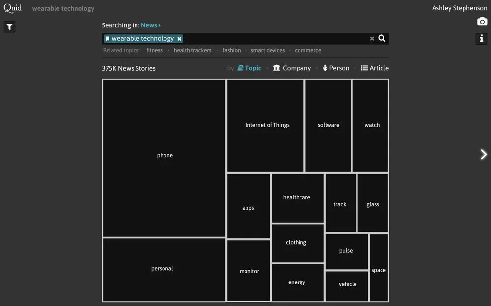
Treemap results highlighting key topics, companies, or people.
-
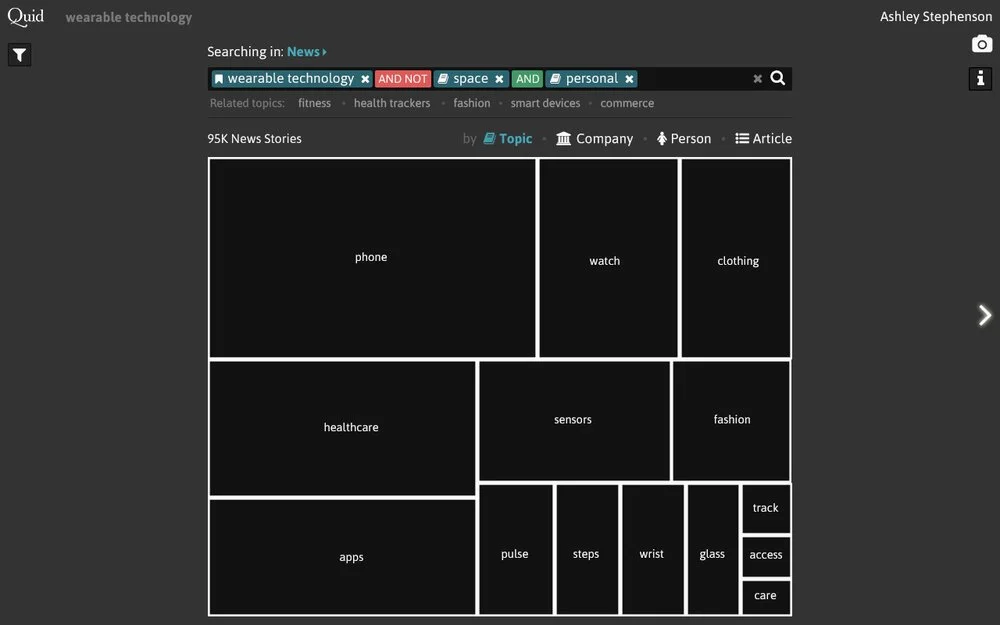
Treemap re-renders as Boolean query builds
Search: The Reality
Responsible UX Designer: Radhika Sawhney
The company was not quite ready for a visual search, but we compromised by showing a faceted search, where facets included topic areas were a reasonable step. Additionally to narrowing the search via filters, related search terms were added to allow users to broaden their search when appropriate.
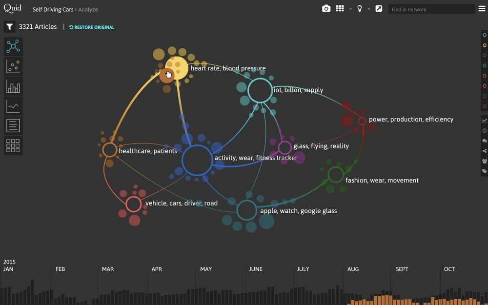
Merging Topics: The Vision
Responsible UX Designer: Oriana Love
Each user had her own mental model of the world, or leveraged the ontologies offered by her industry. As such, when Quid’s unsupervised NLP algorithm generated topics, it often did not match their categorization. As such, the ability to for users to influence the topical clusters from Quid was key. As part of this envisioning session, Invention Disclosures were filed, Extracting Insightful Nodes from Graphs and Summarized network graph for semantic similarity graphs of large corpora.
-
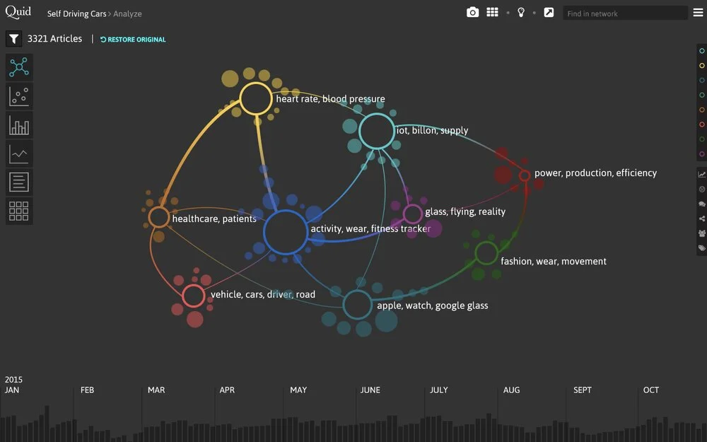
Alternative, Aggregated Network View Showcasing Exemplar Nodes
-
Drag and Drop to Merge Topics that were conceptually similar
-
Apply a Sentiment Lens
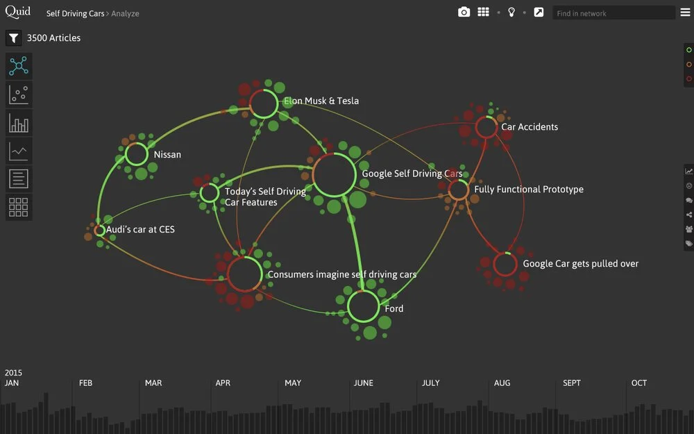
Merging Topics: The Reality
Responsible UX Designer: Oriana Love
We didn’t tackle all the ideas from the Vision all at once. First we introduced better labels, using a new labeling technique, Positioning labels on graphical visualizations of graphs to prevent label collision and allow for maximum readability. Then, we surfaced the ability to merge in a visible way. Eventually, the Quid team did introduce an aggregated network view in some of their Quid App work.
Storytelling: the Vision
Responsible UX Designer: Oriana Love
Through our user research, we discovered that our users sat in the position of influencers to their decision makers. The most effective way to influence was to help convey the result of their findings, and telling and communicating a story regarding how they arrived at their conclusion. As such, we prioritized the ability to tell a story.
-
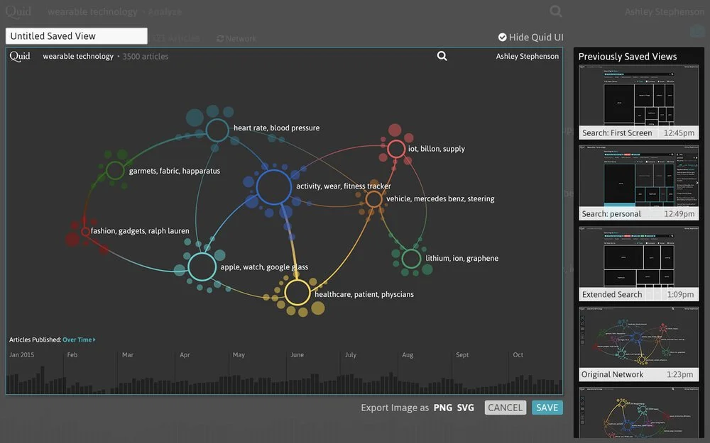
Capture a Version of the Analysis
-
Build the Story
-
Annotate + Share
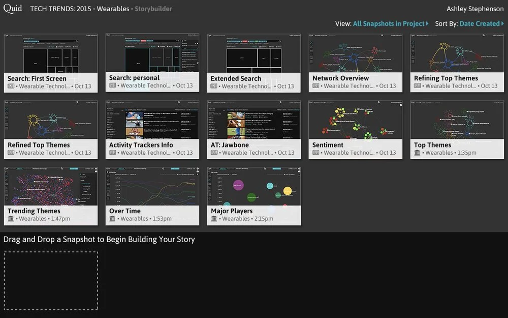
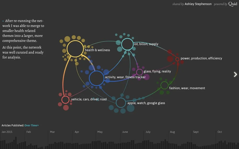
Storytelling: The Reality
Responsible UX Designer: Anna Spisak
Storytelling is a great example where the reality turned out even stronger than the original vision. Users could capture images of their analysis throughout the process, annotate, share, and even download a powerpoint containing their analysis.